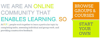
I've already written about P2P.org as one of my favorite places for free classes earlier this year, but a major site re-design along with some new features deserves a second mention here.
As you can see, the new home page makes it much easier to get started and start signing up for classes. Navigation throughout the site is just as simple and intuitive as the homepage.
In addition to the new layout, there are two major changes you'll see right away. The first tweak you'll notice is how much more social P2P feels. As a signed in user you are taken to your profile page where you can post comments that all of your followers can see. You can also find and follow and friends, regardless of whether they are in the same class as you or not. Another feature I really like is that you can follow a class without being an active participant. This is useful if you want to check out what a class is like before taking the plunge.
The second thing I noticed was that classes are now organized as groups. Groups are a place where group members cooperate to create tasks. Each task is like a new wiki page where any member can contribute to the page. The purpose of these pages look pretty open ended. I've seen it used as a place to post homework, describe course objectives, or hold an online discussions.
That's it for the major changes. They have a bunch of new classes open for registration. Obviously a lot of it is going to be tech related, but they also have a School of Social Innovation, and a School of the Mathematical Future. I'm keeping my eye on a beginners blogging course myself.
Here is the full listing of all available courses.


No comments:
Post a Comment